Quickly export multiple R objects to an Excel Workbook

Working with a business audience, I am frequently called upon to send analytic results to clients in the form of Excel Workbooks. The xlsx package facilitates exporting tables and datasets Excel, but I wanted a very simple function that would let me easily export an arbitrary number of R objects to an Excel Workbook in a single call. Each object should appear on in own worksheet, and the worksheets should be named after their objects.

Specifically, the function

save.xlsx("myworkbook.xlsx", mtcars, Titanic, AirPassengers, state.x77)

should save the R objects mtcars (a data frame),  Titanic (a table),  AirPassengers (a time series) and state.x77 (a matrix) to the workbook myworkbook.xlsx. Each object should be in it’s own worksheet and the worksheet should take on the name of the object.

One solution was to write a wrapper for write.xlsx() function in the xlsx package.

save.xlsx <- function (file, ...)
  {
      require(xlsx, quietly = TRUE)
      objects <- list(...)
      fargs <- as.list(match.call(expand.dots = TRUE))
      objnames <- as.character(fargs)[-c(1, 2)]
      nobjects <- length(objects)
      for (i in 1:nobjects) {
          if (i == 1)
              write.xlsx(objects[[i]], file, sheetName = objnames[i])
          else write.xlsx(objects[[i]], file, sheetName = objnames[i],
              append = TRUE)
      }
      print(paste("Workbook", file, "has", nobjects, "worksheets."))
}

Then

save.xlsx("myworkbook.xlsx", mtcars, Titanic, AirPassengers, state.x77)
[1] "Workbook myworkbook.xlsx has 4 worksheets."

spreadsheet

The method will work for data frames, matrices, time series, and tables, and has simplified my workflow greatly.

Posted in R Programming | 1 Comment

Upcoming R Training Course in Boston

boston1R for Software Developers and Data Analysts
Saturday June 28, 2014
9:00am-4:00pm
Microsoft NERD, Cambridge, MA

I’ll be presenting a one day professional development workshop on R programming for software developers and data scientists, sponsored by the Greater Boston Chapter of the ACM.

Topics include

I. Introduction – An introduction to R:  R syntax and data structures; working interactively and in batch; alternative IDEs and GUIs; adding  functionality through packages; common programming mistakes; getting unstuck – where to find answers to your questions.

II. Data Management – Importing, cleaning, and reformatting data:  transforming and recoding variables; subsetting, merging, and aggregating data; control structures; user-written functions.

III. Graphics – Taking advantage of R’s powerful graphics:  creating basic and advanced graphs; customizing and combining graphs; innovative methods for visualizing complex data.

IV. Statistical Analysis and Data Mining – Using R for description, prediction, and classification: descriptive statistics and multi-way tables; ANOVA variants; regression (e.g., linear, logistic, poisson), classification trees, cluster analysis, and other multivariate methods; dealing effectively with missing data; going further.

It should be quite a full day!

Details are available at http://www.gbcacm.org/pds/2014R/index.html .

I am very excited about this opportunity and hope to see you there.

Rob Kabacoff, Ph.D.
Author of R in Action and the Quick-R website (www.statmethods.net)

Posted in R Programming | Leave a comment

New R Workshop in the Bay Area

San FranciscoPractical Data Visualization with R
Saturday March 9th, 2013
8:30-5:00pm
EBay
2161 North 1st Street
San Jose, California

I will be presenting a one day professional development workshop on modern data visualization with R, sponsored by the ACM San Francisco Bay Area Professional Chapter. The course will cover a wide range of topics including base graphics, lattice graphs, ggplot2, and the use of interactive graphics (including iPlots, rrgobi, and googleVis).

Details are available at http://www.sfbayacm.org/event/practical-data-visualization-r.

I hope to see you there!

Posted in R Programming | Leave a comment

Permutation tests in R

Permuation tests (also called randomization or re-randomization tests) have been around for a long time, but it took the advent of high-speed computers to make them practically available. They can be particularly useful when your data are sampled from unkown distributions, when sample sizes are small, or when outliers are present.

R has two powerful packages for permutation tests – the coin package and the lmPerm package. In this post, we will take a look at the later.

The lmPerm package provides permutation tests for linear models and is particularly easy to impliment. You can use it for all manner of ANOVA/ANCOVA designs, as well as simple, polynomial, and multiple regression. Simply use lmp() and aovp() where you would have used lm() and aov().

Example

Consider the following analysis of covariance senario. Seventy five pregnant mice are divided into four groups and each group receives a different drug dosage (0, 5, 50, or 500) during pregnancy. Does the dosage of the drug affect the birthweight of the resulting litters, after controlling for gestation time and litter size?

The data are contained in the litter dataframe available in the multcomp package. The dependent variable is weight (average post-birth weights for each litter). The independent variable is dose, and gestation time and litter size are covariates contained in the variables gesttime and number respectively.

If we were going to carry out a traditional ANCOVA on this data, it would look something like this:

> library(multcomp)
> data(litter)
> mod1 <- aov(weight ~ number + gesttime + dose, data=litter)
> summary(mod1)
            Df Sum Sq Mean Sq F value  Pr(>F)   
number       1   69.8   69.77   4.367 0.04038 * 
gesttime     1  143.7  143.70   8.994 0.00378 **
dose         3  122.8   40.93   2.562 0.06196 . 
Residuals   68 1086.4   15.98                   
---
Signif. codes:  0 ‘***’ 0.001 ‘**’ 0.01 ‘*’ 0.05 ‘.’ 0.1 ‘ ’ 1 

It appears that while litter size and gestation time are significantly related to average birthweight for a litter, the drug dosage is not (p = 0.062). (Note that the order of effects in the aov statement is important. Effects later in the list are adjusted for effects earlier in the list. This is the sequential or Type I sums of squares approach.)

One of the assumptions of the ANCOVA model is that residuals are normally distributed. Let’s take a look.

> qqnorm(resid(mod1), main="Normal Q-Q Plot")
> qqline(resid(mod1), col="red"))

From the graph, we have to question the normality assumption here. Note the deviations from the line.
Normal Q-Q plot for Residuals

An alternative to the tradional analysis of covariance is a permutation verion of the test. The test is valid even if we violate the normality assumption. To perform the test, simply replace the aov() function with aovp().

> library(lmPerm)
> mod2 <- aovp(weight ~ number + gesttime + dose, data=litter)
[1] "Settings:  unique SS : numeric variables centered"
> summary(mod2)
Component 1 :
            Df R Sum Sq R Mean Sq Iter Pr(Prob)   
number       1    64.85    64.849 4724  0.02075 * 
gesttime     1   153.99   153.986 5000  0.00340 **
dose         3   122.80    40.934 5000  0.03720 * 
Residuals   68  1086.42    15.977                 
---
Signif. codes:  0 ‘***’ 0.001 ‘**’ 0.01 ‘*’ 0.05 ‘.’ 0.1 ‘ ’ 1 

There two things to note here. First, the aovp() function calculates unique sums of squares (also called Type III SS). Each effect is adjusted for all other effects, so order does not matter. Second, the dose effect is now significant (p = 0.038), suggesting that drug dose impacts birth weight after controlling for litter size and gestation period.

There are many situations were traditional linear model significance tests are not optimal (including when data is notably non-normal, there are outliers, and when sample sizes are too small to trust asymptotic results). In these cases, permuation tests may be viable alternatives.

To learn more about permuation tests in R see chapter 12 of R in Action.

Posted in R Programming | 5 Comments

R Training Course in the Bay Area

San FranciscoAn introduction to R for sofware developers and data analysts
Saturday March 10th, 2012
8:30-5:00pm
EBay
2161 North 1st Street
San Jose, California

I will be presenting a one day professional development workshop on R programming for software developers and data scientists, sponsored by the ACM San Francisco Bay Area Professional Chapter and Revolution Analytics.

Details are available at http://www.sfbayacm.org/event/introduction-r-software-developers-and-data-analysts. I am very excited about this opportunity and will provide more information as the date approaches.

Posted in R Programming | 2 Comments

Getting Fancy with 3-D Scatterplots

R has some great functions for generating scatterplots in 3 dimensions. Two of the best are the scatter3d() function in John Fox’s car package, and the scatterplot3d() function in Uwe Ligges’ scatterplot3d package. In this post, we will focus on the later.

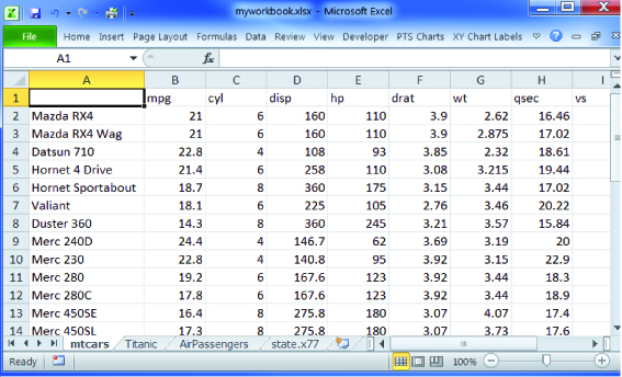
Let’s say that we want to plot automobile mileage vs. engine displacement vs. car weight using the data in the mtcars dataframe.

library(scatterplot3d)
with(mtcars, {
   scatterplot3d(disp,   # x axis
                 wt,     # y axis
                 mpg,    # z axis
                 main="3-D Scatterplot Example 1")
})

The resulting plot is given below.
3-D Scatterplot Example 1

Now lets, modify the graph by replacing the points with filled blue circles, add drop lines to the x-y plane, and create more meaningful labels.

library(scatterplot3d)
with(mtcars, {
   scatterplot3d(disp, wt, mpg,        # x y and z axis
                 color="blue", pch=19, # filled blue circles
                 type="h",             # lines to the horizontal plane
                 main="3-D Scatterplot Example 2",
                 xlab="Displacement (cu. in.)",
                 ylab="Weight (lb/1000)",
                 zlab="Miles/(US) Gallon")
})

3-D Scatterplot Example 2

Next, let’s label the points. We can do this by saving the results of the scatterplot3d() function to an object, using the xyz.convert() function to convert coordinates from 3D (x, y, z) to 2D-projections (x, y), and apply the text() function to add labels to the graph.

library(scatterplot3d)
with(mtcars, {
   s3d <- scatterplot3d(disp, wt, mpg,        # x y and z axis
                 color="blue", pch=19,        # filled blue circles
                 type="h",                    # vertical lines to the x-y plane
                 main="3-D Scatterplot Example 3",
                 xlab="Displacement (cu. in.)",
                 ylab="Weight (lb/1000)",
                 zlab="Miles/(US) Gallon")
    s3d.coords <- s3d$xyz.convert(disp, wt, mpg) # convert 3D coords to 2D projection
    text(s3d.coords$x, s3d.coords$y,             # x and y coordinates
         labels=row.names(mtcars),               # text to plot
         cex=.5, pos=4)           # shrink text 50% and place to right of points)
})

3-D Scatterplot Example 3

Almost there. As a final step, we will add information on the number of cylinders each car has. To do this, we will add a column to the mtcars dataframe indicating the color for each point. For good measure, we will shorten the y axis, change the drop lines to dashed lines, and add a legend.

library(scatterplot3d)
# create column indicating point color
mtcars$pcolor[mtcars$cyl==4] <- "red"
mtcars$pcolor[mtcars$cyl==6] <- "blue"
mtcars$pcolor[mtcars$cyl==8] <- "darkgreen"
with(mtcars, {
    s3d <- scatterplot3d(disp, wt, mpg,        # x y and z axis
                  color=pcolor, pch=19,        # circle color indicates no. of cylinders
                  type="h", lty.hplot=2,       # lines to the horizontal plane
                  scale.y=.75,                 # scale y axis (reduce by 25%)
                  main="3-D Scatterplot Example 4",
                  xlab="Displacement (cu. in.)",
                  ylab="Weight (lb/1000)",
                  zlab="Miles/(US) Gallon")
     s3d.coords <- s3d$xyz.convert(disp, wt, mpg)
     text(s3d.coords$x, s3d.coords$y,     # x and y coordinates
          labels=row.names(mtcars),       # text to plot
          pos=4, cex=.5)                  # shrink text 50% and place to right of points)
# add the legend
legend("topleft", inset=.05,      # location and inset
    bty="n", cex=.5,              # suppress legend box, shrink text 50%
    title="Number of Cylinders",
    c("4", "6", "8"), fill=c("red", "blue", "darkgreen"))
})

3-D Scatterplot Example 4

One of R‘s most attractive features is that it allows us to manipulate output and deeply customize graphs. This article has just touched the surface. Since colors and text labels can be input as vectors, you could programmatically use them to represent almost anything. For example, point colors and/or labels could be used to highlight observations that are outliers, have high leverage, or are unusual in some other way. Simply create a vector that has colors or labels for notable observations and missing (NA) values otherwise.

Posted in R Programming | 8 Comments

Staying up with R

No, I don’t mean late night coding. R is constantly changing – both as a language and a platform. Updates containing new functionality are frequent. New and revised packages appear several times a week.  Staying current with these myriad changes can be a challenge.

In this post, I thought that I would share some of the online resources that I have found to be most useful for keeping current with what is happening in world of R.

Of course the R project homepage (www.r-project.org) and the Comprehensive R Archive Network (CRAN; cran.r-project.org) are  your first stops for all things R.

CRANberries (dirk.eddelbuettel.com/cranberries/) is a site that aggregates information about new and updated packages, and contains links to CRAN for each.

Planet R (planetr.stderr.org) is a great site aggregor, and includes information from a wide range of sources (including CRANberries). This is my first stop for staying up on new packages.

R Bloggers (www.r-bloggers.com)  is a central hub (blog aggregator) for collecting content from bloggers writing about R. It contains several new articles each day and I am addicted to it. It is a great place to learn new analytic and programming techniques.

The R Journal (journal.r-project.org) is a freely accessible refereed journal containing articles on the R project and contributed packages. This is a great way to gain deeper insight into what specific packages can do.

The Journal of Statistical Software (www.jstatsoft.org) is also a freely accessbile refereed journal and contains articles, book reviews, and code snippets on statistical computing topics. There are frequent articles about R.

Finally, R-Help, the main R mailing list (stat.ethz.ch/mailman/listinfo/r-help), is the best place to ask questions about R. Be sure to read the FAQ before posting or you may get flamed by veteran programmers. The archives are searchable and contain a wealth of information.

These are my favorites – the ones I go back to again and again. What are yours?

Posted in R Programming | 4 Comments

Easy cell statistics for factorial designs

A common task when analyzing multi-group designs is obtaining descriptive statistics for various cells and cell combinations.

There are many functions that can help you accomplish this, including aggregate() and by() in the base installation, summaryBy() in the doBy package, and describe.by() in the psych package. However, I find it easiest to use the melt() and cast() functions in the reshape package.

As an example, consider the mtcars dataframe (included in the base installation) containing road test information on automobiles assessed in 1974. Suppose that you want to obtain the means, standard deviations, and sample sizes for the variables miles per gallon (mpg), horsepower (hp), and weight (wt). You want these statistics for all cars in the dataset, separately by transmission type (am) and number of gears (gear), and for the cells formed by crossing these two variables.

You can accomplish this with the following code:

options(digits = 3)
library(reshape)

# define and name the statistics of interest
stats <- function(x)(c(N = length(x), Mean = mean(x), SD = sd(x)))

# label the levels of the classification variables (optional)
mtcars$am   <- factor(mtcars$am, levels = c(0, 1), labels = c("Automatic", "Manual"))
mtcars$gear <- factor(mtcars$gear, levels = c(3, 4, 5),
                      labels = c("3-Cyl", "4-Cyl", "5-Cyl"))

# melt the dataset
dfm   <- melt(mtcars,
              # outcome variables
              measure.vars = c("mpg", "hp", "wt"),
              # classification variables
              id.vars = c("am", "gear"))

# statistics for the entire sample
cast(dfm, variable ~ ., stats)

# statistics for cells defined by transmission type
cast(dfm, am + variable ~ ., stats)

# statistics for cells defined by number of gears
cast(dfm, gear + variable ~ ., stats)

# statistics for cells defined by each am x gear combination
cast(dfm, am + gear + variable ~ ., stats)

The output is given below:

  variable  N   Mean     SD
1      mpg 32  20.09  6.027
2       hp 32 146.69 68.563
3       wt 32   3.22  0.978

         am variable  N   Mean     SD
1 Automatic      mpg 19  17.15  3.834
2 Automatic       hp 19 160.26 53.908
3 Automatic       wt 19   3.77  0.777
4    Manual      mpg 13  24.39  6.167
5    Manual       hp 13 126.85 84.062
6    Manual       wt 13   2.41  0.617

  gear  variable  N   Mean      SD

1 3-Cyl      mpg 15  16.11   3.372
2 3-Cyl       hp 15 176.13  47.689
3 3-Cyl       wt 15   3.89   0.833
4 4-Cyl      mpg 12  24.53   5.277
5 4-Cyl       hp 12  89.50  25.893
6 4-Cyl       wt 12   2.62   0.633
7 5-Cyl      mpg  5  21.38   6.659
8 5-Cyl       hp  5 195.60 102.834
9 5-Cyl       wt  5   2.63   0.819

          am  gear variable  N   Mean      SD
1  Automatic 3-Cyl      mpg 15  16.11   3.372
2  Automatic 3-Cyl       hp 15 176.13  47.689
3  Automatic 3-Cyl       wt 15   3.89   0.833
4  Automatic 4-Cyl      mpg  4  21.05   3.070
5  Automatic 4-Cyl       hp  4 100.75  29.010
6  Automatic 4-Cyl       wt  4   3.30   0.157
7     Manual 4-Cyl      mpg  8  26.27   5.414
8     Manual 4-Cyl       hp  8  83.88  24.175
9     Manual 4-Cyl       wt  8   2.27   0.461
10    Manual 5-Cyl      mpg  5  21.38   6.659
11    Manual 5-Cyl       hp  5 195.60 102.834
12    Manual 5-Cyl       wt  5   2.63   0.819

The approach is easily generalized to any number of grouping variables (factors), dependent/outcome variables, and statistics, and gives you a powerful tool for slicing and dicing data.

Posted in R Programming | 1 Comment

Quick-R Gets a Blog

After maintaining the  Quick-R website (R tutorials and jumpstart) for the past 5 years, I’ve decided to add a blog so that I can go into more detail on topics related to practical data analysis.

The statMethods blog will contain articles about data analysis, statistics, and graphics, with an emphasis on the R language.

Of course, I’ll continue to maintain Quick-R, and hope that you find this addition resource useful. Let me know if there are topics that you would like to hear about.

– Rob Kabacoff

Posted in R Programming | 11 Comments